My Work || A Charming Cottage Kitchen
I'm so excited to finally share this charming kitchen with you! The homeowners, Matt and Katie, are best friends and neighbors of ours and it was such a honor to have them entrust me to create their dream kitchen.
I've "helped" them decorate their home over the years with a suggestions here and there, talking Katie into and out of purchases and starting her obsession with check fabric. She is totally responsible for my love of embroidered clothing, so you see, we are good for each other. ;) However, when she first asked to me to design their kitchen, I wasn't so sure it was the best idea. When you are so close to someone and know their taste so well it could either be a match made in heaven or put a strain on the friendship. I have really strong opinions about what I think will look best and there were a few areas that took some convincing (I lost the battle for a butler's pantry and I might still mention it every time I'm over. Haha.) Thankfully, the whole experience brought us closer together and resulted in a kitchen that couldn't be more "Katie" if it tried.
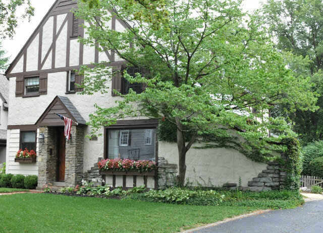
Katie and Matt (and their three beautiful children) live in a 1920s tudor with beautiful old millwork and character filled nooks and crannies. The rooms are small, but cozy and bright, with a very fresh, cottage feel, so my biggest goal was to create a kitchen that was in keeping the period and style of their home, with a scale that made sense with the other rooms. For example, a massive island with seating for five just didn't make sense, even though it took a few rounds to "sell" them.
Their wish list included:
gray painted cabinets
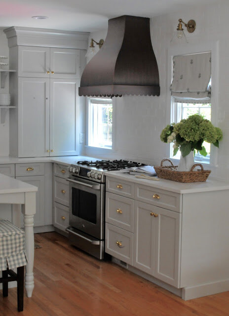
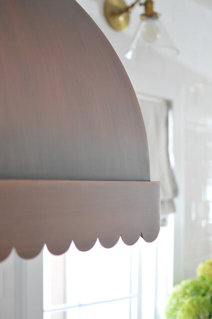
a copper hood with scallops (Katie was in love with one she saw on an episode of Fixer Upper)
a farmhouse sink
an island
open shelving
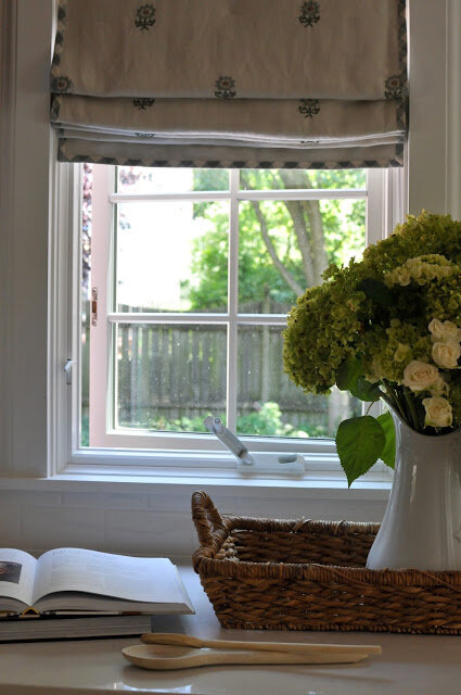
a beautiful fabric for window treatments
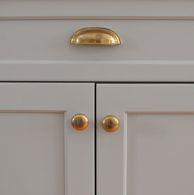
brass hardware (well, at least one of them wanted brass and the other kept referring to his Grandma's brass hardware, that he didn't love.)
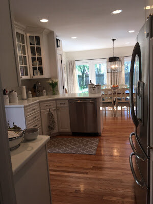
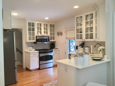
Here are a couple before photos:
^^The new kitchen sits primarily where the counter with the glass cabinets above it is through to the old dining area. The stove wall is where the glass doors were. They have a dining room adjacent to the kitchen for eating as a family now.^^
^^The area where the door and stove are in the above is now closed off to create a laundry room. This is area where I wanted a butler's pantry. Dang laundry and real life. haha^^
AFTER
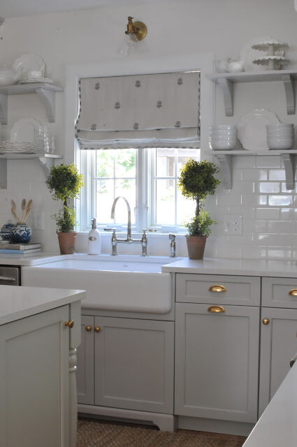
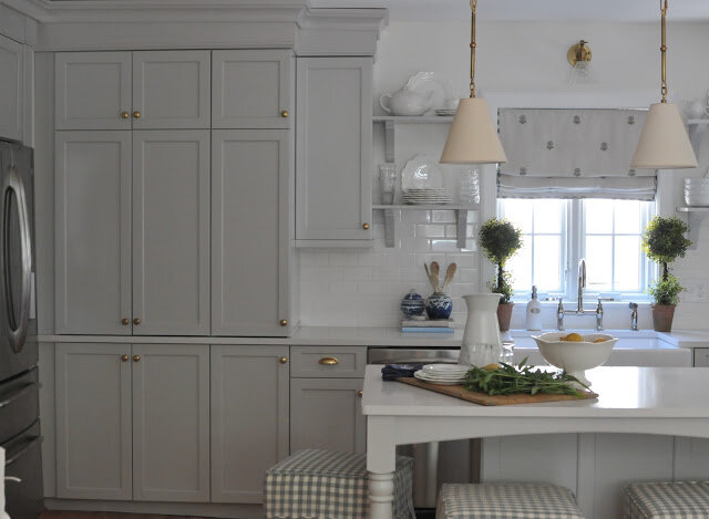
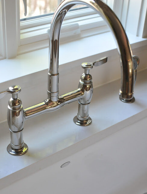
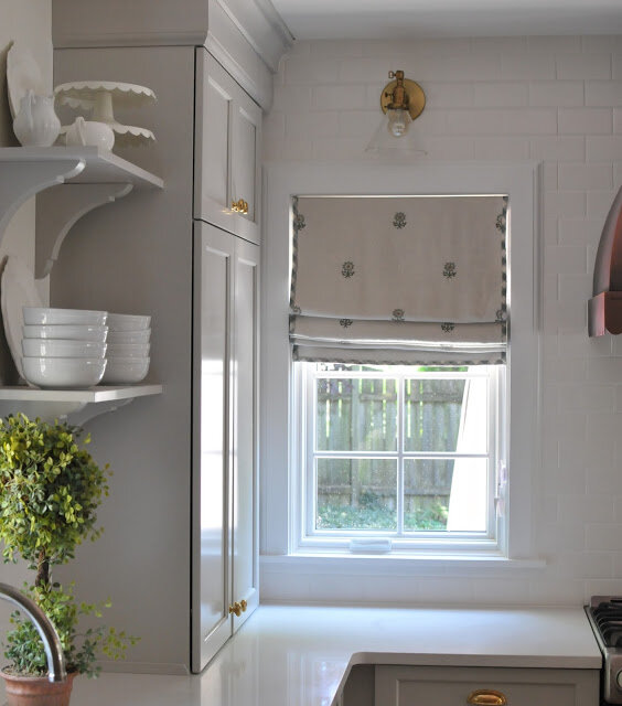
^^ A pretty side by side casement window over the farmhouse sink and little furniture feet on the base of the cabinet made this an extra charming spot. The sconces over all the windows are one of my favorite details. They give off such pretty light too. All the hardware and lights are unlacquered brass that will continue to darken over time.^^
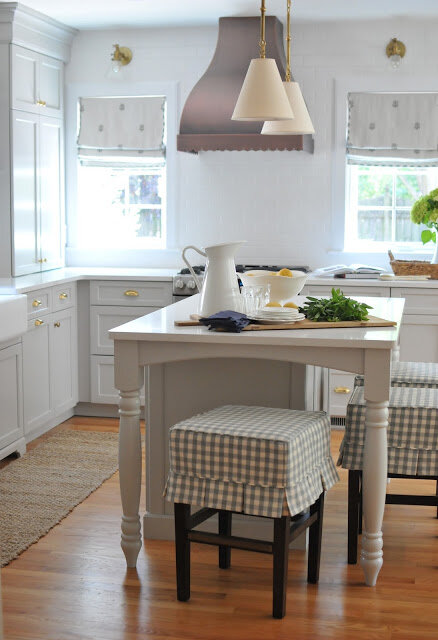
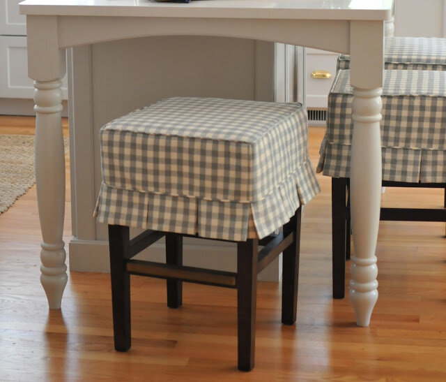
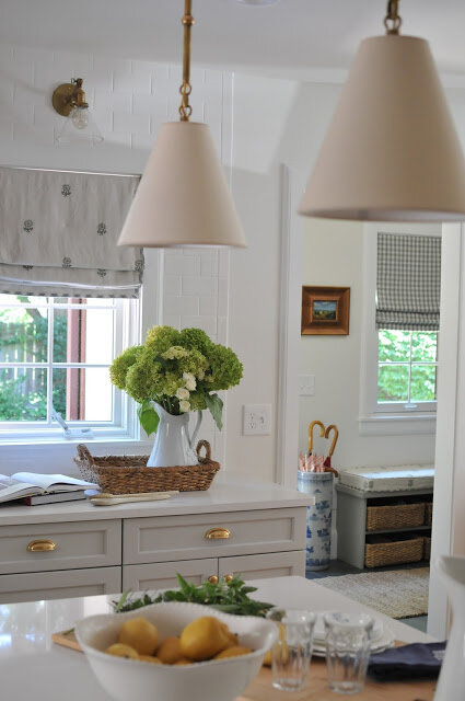
^^Custom slips for the counter stools and farmhouse table legs on the island. I love when there is space to have stools on more than one side, to encourage conversation and make it feel more like a table and gathering spot. The pendants were made with a custom length for 8 foot ceilings. The counters are quartz.^^
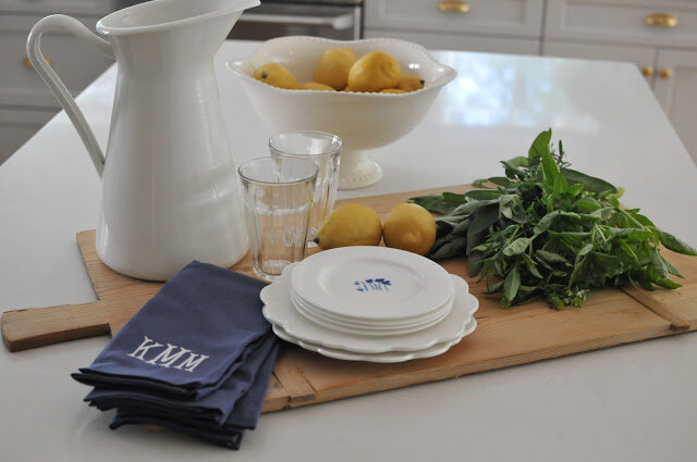
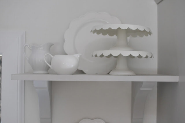
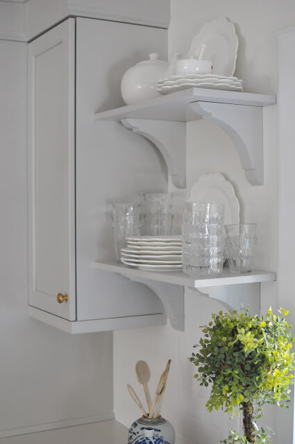
^^ A repetitive scallop detail on the cake stands and plates, in keeping with the cottage feel of the kitchen.^^
^^ Pantry wall^^
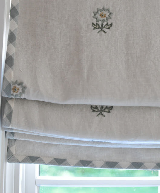
^^ Hours were spent finding the perfect fabric. We both adored this one and knew it was "the one" the second we saw the sample.^^
^^The first plans called for a corner cabinet here to allow for more counter space, so glad we skipped that an added the cabinets down to the counter which feels more like a cupboard^^
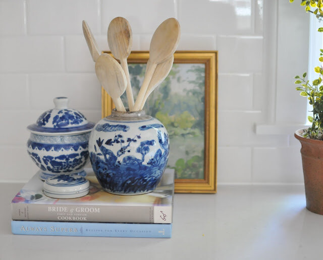
^^White subway tile to ceiling on this wall^^
^^Tile to just under shelves on this wall^^
^^I wanted to show this shot so you could see the adjoining mudroom. I picked out slate tile for the floor and a deeper gray color for the built-ins (there is a full wall of storage cubbies opposite the bench), we pulled in the same fabrics and a touch or blue and white on the umbrella stand to help the spaces to work together. Walls are painted the same as the kitchen. The mudroom was a new addition.^^
They couldn't be happier with the final kitchen and I feel the same!
Thanks for visiting and letting me share the details.
Sources listed below with permission from the homeowners:
Counters: Misty Carrera, Caesarstone
Cabinet Color: Repose Gray, Sherwin Williams
Wall Color: Swiss Coffee, Ben Moore
Hardware: Bona, Oakley, OH
Hood: Custom, Copper Smith
Roman Shade Fabric: Chelsea Editions
Bar Stool Fabric: Chelsea Editions
Sink and faucet: Kohler
Pendant Lights: Circa Lighting
Sconces: School House Electric


